Saturday, November 18, 2006
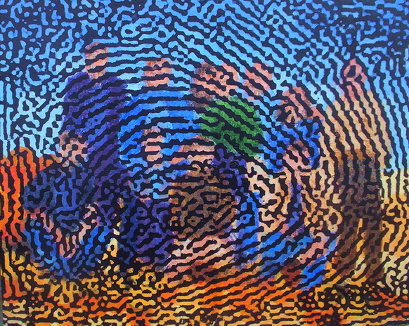
Imprint
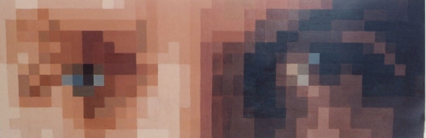
While scanning some photographs at work, I realized that the resolution of the scanner was high enough to enlarge details – and I was curious how a scanner would read three dimensional objects, so I scanned my hand. Enlarging the scanned image revealed details right down to fingerprints. I changed a fingerprint to black & white and tried overlaying it on different images. Searching for images to underlay the fingerprint, I understood that I needed something else personal for a background, and so tried the fingerprint on various photos – an enlargement of an eye as the background led me to consider the developing picture as a personal statement of identity. Because the graphics were more powerful, I decided to overlay the print on a photo of my family. That particular family group was taken at our father’s ash scattering, and is one of the few times our family was together for a group photograph. I purposefully blurred the background when I painted it, to give the idea rather than the details. I attempted painting the fingerprint over the picture, but realized that it was an impossible task, so opted for a technique of enlarging a photocopy of the print and transferring it to the canvas. The picture came out with its contrast and message intact.
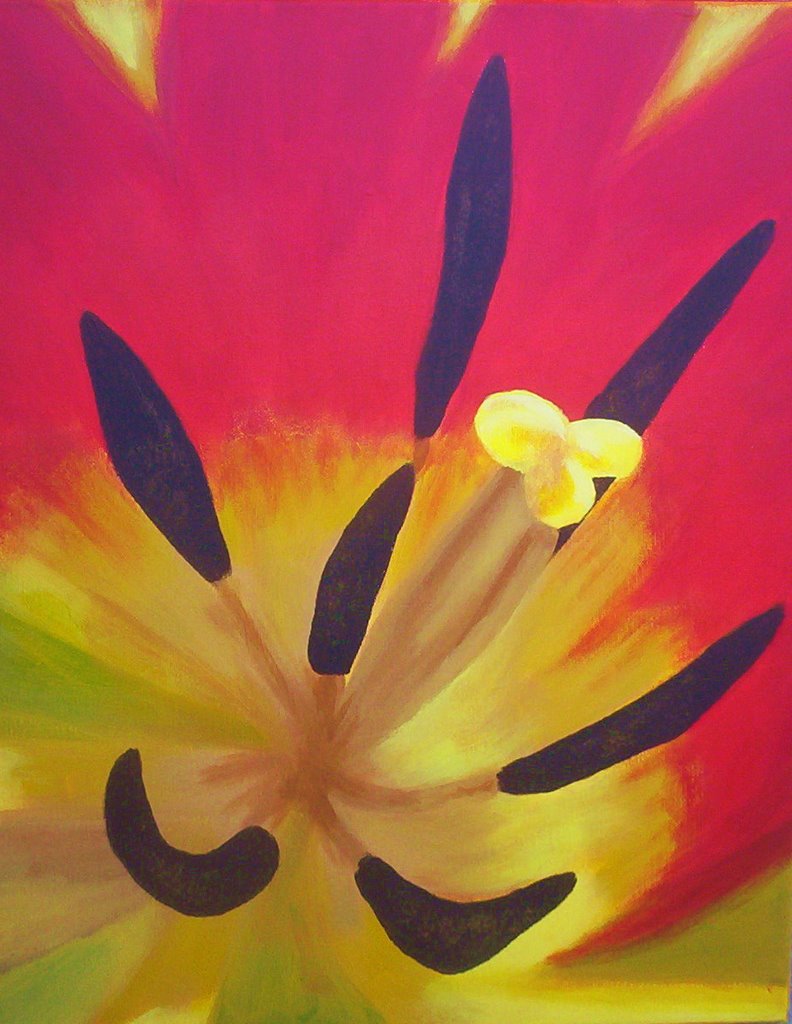
Macro
While studying pictures of tulips for the Roots picture, I came across a few close-up pictures and was struck by the contrast of the dark stamens and the background colour field. In a thing of beauty there is also a the dark spider points of the stamen. Apart from the visual impact, there exists the fact that a flower is a plant’s sexual organ surrounded by petals and colours which attract pollinators. It is these strong elements which drew me to attempt the picture. At the time of painting I had on hand only one small canvas, but realized that the strong design, and particularly the fact that the picture was a close-up, would e more surprising if the artifact itself was a small thing with a big subject. The painting was remarkably quick and easy to accomplish. The only change I had to make from the original design was to add a seventh stamen. Once the first strong design was painted, I realized that there was a gap in one area of the picture, and had to sacrifice the truth of six tulip stamens to achieve balance.
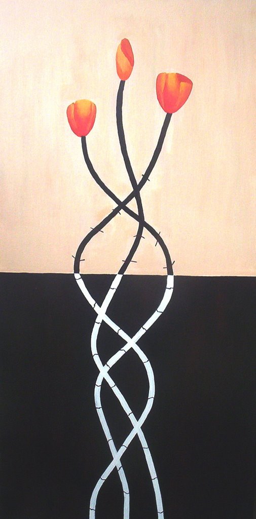
Roots
One day while watching an Italian soap opera I caught a glimpse of a minimalist picture with the top half painted white & the bottom half painted black - two simple blocks of non colour. The basic design suggested to me, though it might suggest something different to everyone, the contrasts of earth and air, so I thought of planting something.
That One
The original idea was to express the chaos of thought and the process behind any banal decision or act. Our decisions are influenced by the millions of units of information we take in every day. Each option commands attention, eventually resolving into a decision. I wanted the demonstration of a decision made to be painted in realistic style, the thought behind (out back) to be a graffiti scramble, a bombardment of image & word. I learned from speaking other languages that we always scramble, even rehearse, putting thought and desire into word and action. I thought of a banal task like buying a pack of cigarettes and backed it up with a heedful of icons, principles and emotions. The written strips at the beginning of the painting could represent formal learning, which filtered through the brain’s collective colourful storehouse, arrive at nothing more than the banal gray decision, yet the brainstorm of arriving there is a wonder to behold. The center graffiti section of the painting presented the most challenges. I had experimented with transferring photocopies to canvas and decided that some of the classic images of our culture were stronger as tencil graffiti, and some hand lettering added street crudeness. I tried my hand at a tag in the center of the painting and gained immense respect for this art form. The splatters of paint roughen the wall of thought and are like brain static. I wanted the painting to explore one of my pet themes – that of a moment stopped in time.

Up the Creek
The original idea was to paint rocks underwater. I photographed lake and creek stones, and in looking at them was struck by the images of rushing water. I decided to combine the stones and waterfall, and treat it as life itself, diverted by powerful forces, a period of crisis through the waterfall, the boulders playing the immovable cause of this crisis. The water’s rapid change of form results in the beautiful clarity of the multicolored stones laid exposed gemlike facets of a personality. Everything becomes clear in the end. I started painting pebbles as a way to entering into the body of the painting. At one point they were finished, I added a sunlight glaze dapple, hated the effect and had to repaint all of the stones. I had intended the two side boulders to be more forceful, abstract, with edges and force pointing inward to the waterfall, but after several unsatisfactory design tries, I decided to go ahead and paint the waterfall. This came out so well that I didn’t want to ruin its effect by being too drastic with the boulders. The contrast of states was the original idea so I decided to leave the boulders smooth and realistic. I kept the water in the top of the picture dark, deep, slower flowing, so that the shock of the waterfall emphasized the water’s previous state, its adolescence, which rushes to the crises of maturing, and opens to serenity of age. Once the waterfall was painted with its dress form, the body seemed to be missing so I carried the veil of two arms and a head upstream and helped suggest movement. Once painted, the waterfall, to me, suggested a woman’s dress, a long gown, and that some proper placement of marks on the boulders could lean toward the waist and the knees of the gown. One planet like boulder could suggest the force of harmony, and the other boulder with its clawed fist suggest the force of destruction. Sybil and Charybdis? Green has a neutral place in this picture, some moss and a few plants. It helps hold down the real blackness underneath.

Fetish
When I made bracelets I often had large beads left over from old necklaces and couldn’t decide what to do with them. The idea came to me to make small puppet figures from these beads to be used a key chains or just decorations to hang from the belt or handbag. fter I had made a few, I though that it might be interesting to paint one of these bead puppets. I explored many poses my painted puppet could adopt including dancing and running. Somehow the pose of Christ on the cross appealed to me, as I intended to put a facial expression on the puppet of a slightly simpering, pleased with himself smile in stark contrast to the implication of the pose. studied many pictures of crucifixions to establish the exact body pose I wanted and to find one which would fit with the type of beads of the original puppet. The original puppet had dark blue beads mixed with a few silver ones. The background needed to be dramatic and contrasting so I chose much the same red I had used in the Mars picture as it also couldsymbolize blood. I originally painted the puppet in both form and colour very close to its original design, except that I couldn’t quite get the facial expression I was after, so I decided to leave this out. I had always intended to paint the puppet hanging from strings and decided after a couple of tries at painting string, to use real string. As the puppet was hanging in space I thought I needed some decoration at the level of the feet to fill in the space and balance the picture. Since I had already used string to hang the puppet from, I thought that coiled string would give both texture and visual impact. Once I had added a few coils, I realized that I had inadvertently attached 12 and was immediately struck by the relation the Apostles. The gray coils also needed some contrast so I added a black coil to symbolize Judas and the larger light blue one higher than the rest to symbolize Mary Magdalene. Once I had most of the painting done I realized that the head without the face was lacking interest, so I made many sketch of haloes, heads in boxes, and headdresses. In the end I settled on the simple pieces of string rather like a native American headdress. Once the picture was complete, I realized that it could almost be a “Fetish” or an object of power or worship, like a talisman kept at hand, a good luck charm, or a symbol of power and luck. The more I realized the spiritual nature of the idea, the more I realized that the symbols of many religions including Christianity are no different than ancient tribal fetishes.

I dreamed I was driving
The point of view from inside a car is one familiar to most of us. What’s out the windows sometimes strikes us as unreal, like a movie going by. I wanted to paint something in black & white, with some colour. The colours of the outside world intrigued me more than the black & white, which was a natural for the car. You see it but you don’t really see it unless you are looking at it. The car interior is peripheral. The windshield is a selective overlay of two photos, one of a friends son in Australia running down the path from a boys boarding school, the second looking out of an urban market in Mexico. The Mexican colours of turquoise and salmon dominate the exterior. The windshield is on an angle to emphasize the odd sensation of being in a car not knowing if you are traveling straight ahead, uphill, or town. The action is stopped in time, leaving an uncertainty of whether something has happened or will happen.

Next Wave
One of the pixel series, I wanted something with colour and movement. For colour I chose blue and green and for movement, water. I chose a section of the Japanese print by Hokusai called the Great Wave for the basis of the picture, as it was the best representation of a simple powerful example of moving water.

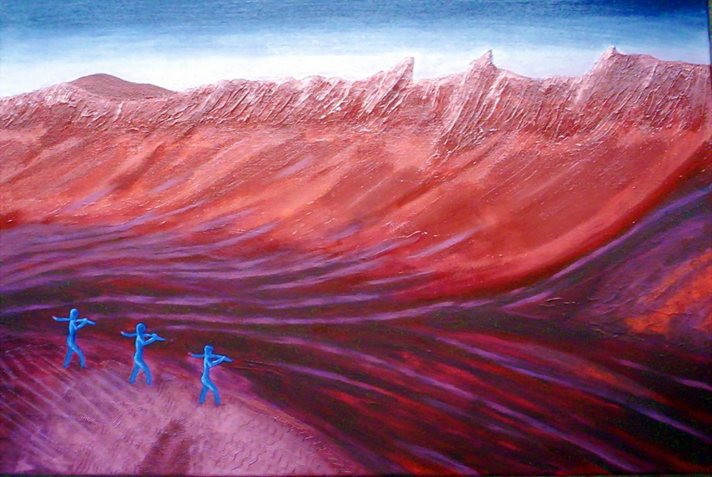
Life on Mars
One of my first paintings was my version of a cave drawing which was called “Trance”. This showed a village group of women, children & youths, dancing or celebrating while three figures walked away from the group. I took these three figures to be hunters and left them out of my painting, but always intended to use them somewhere. I liked the idea that even in prehistoric days, people had to leave their home base to march off to find food – much the same as a person in the modern world marches off to work every day.At the time I painted the Life on Mars picture, Mars robots were sending back pictures of the planet’s surface. It occurred to me that one day, when man had finally set foot on the planet that he might begin mining exploration, which would involve some men trudging off in a space suits to take rock samples. The idea struck me that life on Mars with 3 men marching off to work, would not be much different that life on earth today with men marching off to work, or from men in prehistoric days performed these same “work” tasks for their tribe. Deciding on the colours for the painting was not difficult as I tried to stay within a possible correct Mars palette. I had intended for the workmen to be dressed in suits resembling Exon blue, which also necessitated adding another tone of ble somether in the painting. As the earth was red, I decided to make the sky gray/blue for contrast.
The closer you get....
While watching images of the first days of the Iraq war on television, particularly those live images of embedded troops, I was struck by how poor the image quality was, particularly any movement which seemed to break up into pixels. I though it strange that the most immediate news was not seen clearly, and that to really understand what was happening one would have to wait for later filmed pictures or to wait until the dust had died down. In some way the immediacy of the situation made it less clear – we would have to stand back to see with some perspective what really happened. Once I had decided that I would like to paint something which expressed this lack of clarity close up, and chose a photo I had taken of myself, zoomed in on the eyes. When an image is scrambled in the media to make a person unidentifiable, it is often the eyes which are pixilated. I learned from a nephew, how to pixilate an image and finally decided on the correct degree which wouldn’t entirely obscure the image, nor would be such fine pixilation that the finished painting would seem too much like a photograph.I decided on a large format for the sake of drama and so that the squares of colour I would be painting wouldn’t be impossibly tiny. The difficulty was to keep the same tonal range. The previous pixel picture I had done “Lips” was small and possible to paint in one long sitting. The eyes format would require a more extended time frame.Once I had painted at least a preliminary colour in all of the squares I wanted to see the progress, so had a friend hold the picture up on the balcony of a high rise building. I went down to the street and was shocked to see a perfect photo of my own eyes enlarged. The picture only suffers from an appropriate place to hang it where viewers can see it at a distance and close up. Most people when seeing the picture at normal gallery distance have little idea what it portrays without some hints, but seen from a distance the image is unmistakable.The title “The closer you get…., is a version of an old Clairol hair colour ad, which becomes in my version, “The closer you get…the less you see.”
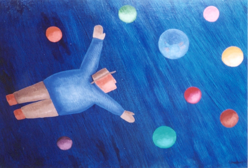
Fritz
A fat man flying among the planets. I had done a cartoon series of the trials of my friend Fritz who is a little on the heavy side and favours suits and fedoras. In these I used the round figure with the hat, and was struck by the lightness of the figure, almost like a bubble. Fritz flying would be accompanied by bubbles, which later took on the aspect of planets. For a while I called the picture “Planet Man He's not going anywhere in particular, just enjoying his flight and occupying a part of space just likve the planets. The original design had a green background as it was a colour I hadn't already used in the planets, but when I began the painting the spacial aspect began to dominate so the blue/black of space was the obvious choice for the background. I attempted to paint one of the planets aalmost transparetn with the feflection of Fritz as he arrived near to it. I suppose I was thinking of the ending of "2001-A Space Odyssey, when a fetus drifts toward a planet.
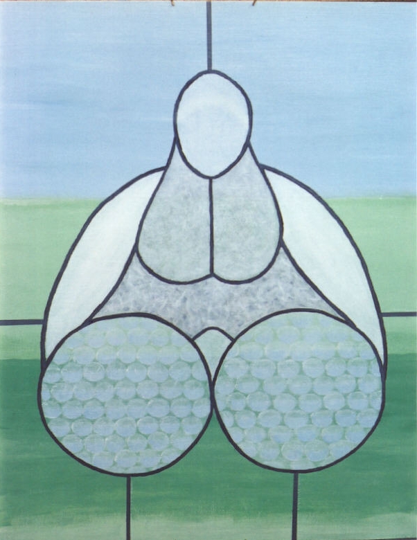
Fertile
When I worked in stained glass 20 years ago, I made a piece using only clear and white glass, based on a phallic design. Once I had stylized to phallus I realized that by adding a small mound between the legs and exaggerating some of the features, I could make the phallus also look like a sitting fat lady. I had only a photograph of the original piece, which even then is broken. One of the challenges was painting enough different styles of textured glass to keep the piece interesting. The dark lines are the same lead lines used to join the original pieces of glass. The original photo was taken with the glasswork against a window with green fields in the background. I decided to stick with this as the “Fat Lady” had become, with her phallic overtones, a definite fertility symbol. The green and blue of outdoors should be her colours. Some reactions can be disconcerting, like the woman who asked if the picture was obscene. Why? She thought if represented ovaries. Strange. Could be. She got the context anyway.
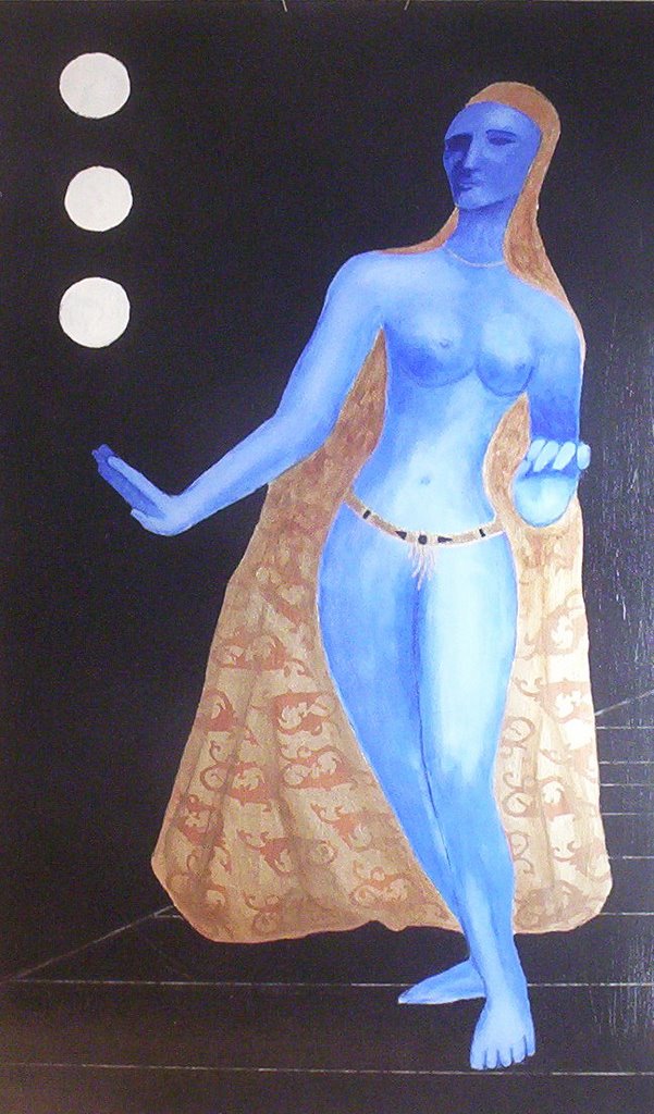
Culture Vulture
I watch a lot of fashion shows, and some if the pvc body suits started me thinking about depersonalization of women and anyone who lives by image. The image as the title suggests is composed of an amalgamation of iconic influences. The body is of the Hindu goddess Tara, the head is from the Statue of Liberty, the design on the cape is taken from Versace tea cups.
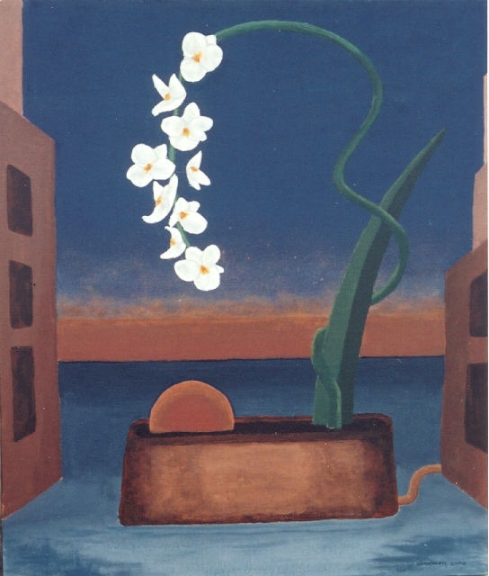
Vita Artificiale
The original idea was to depict something living and growing in a dead world. The background is influenced by Di Chirico with his distorted and dehumanized cityscapes. The orchid is a popular choice for flower paintings, but I also chose the orchid because even real orchids are so delicate, soft and perfect that they appear to be artificial. At the time of the painting I was reconstructing my life after a period of depression, and the image of a beautiful living thing which can flourish in a vacant city was an expression of hope – some flowers can bloom in the most hostile surroundings. Rather than use a simple painting of a flower growing out of concrete, I tried to make the stem more plastic and unreal by twisting it. I also decided to continue the artificiality by having the plant self-sufficient. The plant’s water comes out of a building like a city water main and the source of the plant’s sunshine almost grows out of its own earth. The background and the base of the flower are painted in flat tones, and the bloom itself and a part of the stem are mixed with acrylic medium to make them shine and stand out from their dull surroundings.
Lips
This was a first attempt at pixel painting. I had already established the idea and form for the larger “The closer you get..” eyes, but wanted to attempt the process on something of a manageable size. There is an implied contrast between the geometrics of the construction and the softness of lips. The actual lips are taken from a photograph I took of a friend. In order to maintain colour tone, this picture was painted in one sitting. I had already mapped out the colour blocks and numbered them from darker to lighter. In one eight hour session I filled in all of the tiny blocks. The only canvas I had on hand was one larger that the image I wanted, so I had intended that the top and bottom should resemble the blank blue screen of a television. Once the lips were finished, I decided on the more dramatic black header & footer with the graphic white stripe for contrast.

D'Uomo
I had been intrigued and was searching for images of a pile of bodies, an image which unfortunately is all too common in our modern world – images of massacres. I had also always wanted to paint a dome, and had done several sketches with ladies dancing under a dome – but hadn’t developed this further as it lacked drama and tension. I realized that by putting the two ideas together I could make a political statement – that being, in spite of all of our wonderful structures which attempt to convey our spirituality, we more often manage to create only another type of dome, that of a pile of bodies. After searching for the perfect dome I settled on the dome of the church in Sienna. Its star designs helped to emphasize the spiritual aspect I needed for the dome. The pile of bodies in left almost unfinished, dirty, undetailed, as I had flirted with he idea of just painting a pile of shit under the dome, but decided to make the disgusting heap more shocking, yet somehow amorphous like a pile of dung. This stinking heap under the beauty of the dome helped emphasize the dichotomy. The light from the dome appears in many photos of dome interiors and as a single source of light, it leads the eye upward to heaven. This beam points straight to the worst accomplishments of man. The title D’uomo is a play on the words duomo which mean dome and uomo which means man.

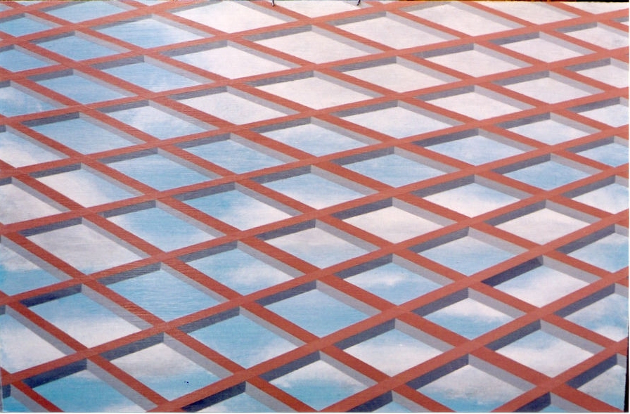
WWW
The original of this painting was a coloured pencil sketch, and was an attempt to portray how a modern building with its skeleton structure of beams and plate glass windows, when seen from below sometimes have a dizzying vertiginous quality. articularly when looking up at building with clouds passing overhead, there is sometimes the sensation that either the building or the viewer is falling. The original sketch was of just the beams, done in 3 dimensions with the exterior surface in pink and the two inner parts of the beam in two tones of grey. Even in the original, the background was light blue to resemble the sky, as in working n the drawing I realized that I was actually drawing a glass & steel building and that the reflection should be the sky. When I came to make a painting of this idea, I could play up the sky element by painting in clouds before the grid of the building was painted on. While working on the painting, I also realized that the grid of the girders also resembled a net over the sky. This could be either a protective net or a constraining net, which in any case led me to think of the possibility that it could stand for the Internet or World Wide Web, with connotations for either better or worse.
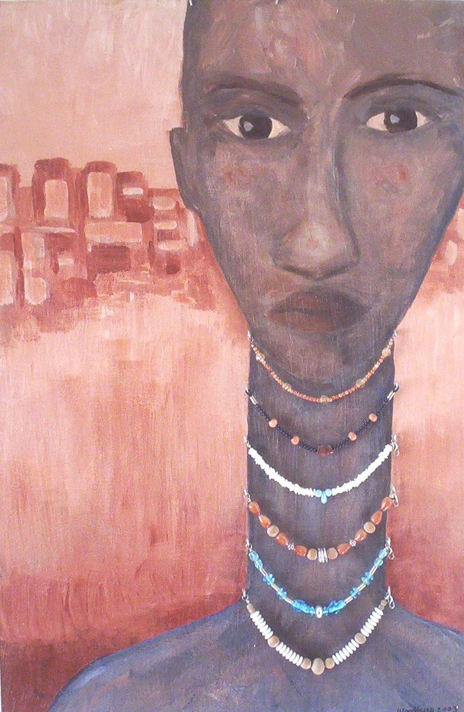
Display
Sometimes during the winter I take up making bracelets to pass the evenings and to create something at the same time as carrying on a onversation or watching television. I wear bracelets myself and was full of ideas, particularly using old necklaces or bags of used mixed beads I found in second hand stores. I needed a display board to display the bracelets, aside from the regular black velvet. A look at a Modigliani portrait led to the idea for the design. A Sahara look would play up the tribal aspect of the bracelets. I asked a friend who sketches to do a face for me, and I kept his primitive look with its uneven eyes, important nose and sensual lips, down to the sloping thin shoulders. Because the tone would be all warm earth colours, I introduced blues to the body to give the lady depth against her hot dry background. People taken aback to see that the beads are real, as it is both beads and eyes which pull one toward the picture.
Subscribe to:
Posts (Atom)
